
Do you know that you can grab the user information from your website in various ways?
Would you like the user on your website to type a text, provide you with an email, or create a password on your website?
Yes, this is possible with the help of different HTML input types.
I will provide you with detailed information on different types of HTML form input with the type attribute. I will explore this with the help of code and visual examples.
Let us discuss these input types one by one and see the functionality.
Note: I have attached a codepen with all the example of HTML input types where you can do practice by yourself. Click on the table of content last link to see the codepen example.
Table of Contents
<input type=”button”>
The <input> element with the type attribute of a button will create a button. This button will have a default value attribute with an empty value.
Note: Pls check the browser support for this element click here
Example of <input> type button without value attribute-
<form method="post">
<input type="button">
</form>
The output will be:-

Example of <input> type button with value attribute-
<form method="post">
<input type="button" value="click here">
</form>
The output will be:-

<input type=”checkbox”>
The <input> element with the type checkbox will help a user select a single value. The checkbox, as the name defines, looks like a square box in front of the value to be selected, and when a user clicks on that box, it activates.
Note: Pls check the browser support for this element click here
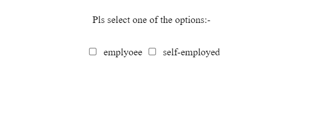
Example of <input> type checkbox-
<form method="post">
 <div>
  <p>Pls select one of the options:-</p>
 </div>
 <div>
  <input id="emplyoee-checkbox" type="checkbox" name="emplyoee">
  <label for="emplyoee-checkbox">emplyoee</label>
  <input id="self-employed-checkbox" type="checkbox" name="self-employed">
  <label for="self-employed-checkbox">self-employed</label>
 </div>
</form>
The output of the above code:-
Suppose you would like to precheck or preselect one of the input options. In that case, you can assign a checked attribute to that input element.
I have assigned checked attribute to the <input> element in the following example:-
<input id="emplyoee-checkbox" type="checkbox" name="emplyoee" checked>
The output of this code:-

<input type=”color”>
The <input> type color makes a square box of color picker, which opens when a user click on that. It is a sort of control by which a user can select a color . Moreover, the type color also provides a color picker eyedropper. A user can choose any colour of the browser colors.
This type of element is commonly used in content management systems such as wordpress, where a user can customize the website elements color by selecting a color from the color picker.
Note: Pls check the browser support for this element. click here
I have assigned a default color with the value attribute.
Example of <input> type color –
<form method="post">
 <div>
  <input type="color" id="header" name="header" value="#e66465">
  <label for="header">assign color for header</label>
 </div>
</form>
The output will be:-

You can assign a value attribute with hexadecimal value as a default color.
<input type=”date”>
This <input> type with the value of date of allows a user to select a date from the date picker which opens after click on the box. Moreover, a user can write a date manually in the date box.
I have written the HTML code by using the default value, along with min and max attributes.
You can read more about date attributes. click here
Note: Pls check the browser support for this element. click here
Example of <input> type date –
<form method="post">
 <div>
  <label for="dob">DOB:</label>
  <input type="date" id="dob" name="DOB" value="1980-01-01" min="1980-01-01" max="2020-12-31">
 </div>
</form>
The output for the above code:-

This input type date element only provides the results in date, not the time.
<input type=”datetime-local”>
The <input> element with type datetime-local allows a user to select a date in days, months and year. Moreover, it also gives an extra box where a user can input time in hours and minutes. I have written the code for input type datetime-local where I have also assigned attributes such as min, max, name, value and id.
You can even set the time zones with the type datetime-local. For more information click here
Note: Pls check the browser support for this element. click here
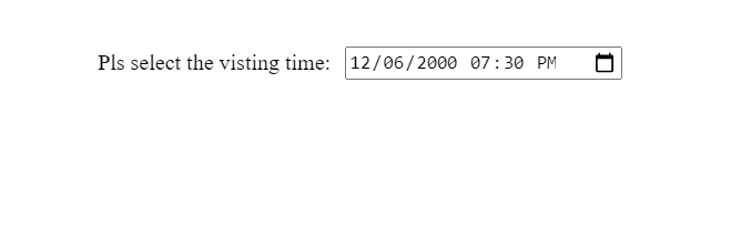
Example of <input> type datetime-local –
<form method="post">
 <div>
  <label for="visitor-time">Pls select the visting time:</label>
   <input type="datetime-local" id="visitor-time" name="visitor-time" value="2000-06-12T19:30" min="2020-06-07T00:00" max="2022-06-14T00:00">
 </div>
</form>
The output will be:-
It is supposed that this datetime-local provides user’s local time, but only in some cases. Moreover, a few of the browsers support this input type. To see better results, you can use date and time attributes separately.
<input type=”email”>
The <input> element with type email helps a user to input the email address. This input type element has the same look as text type input element but it comes with validations and pattern attributes.
I have used the required attribute to submit the form with an empty email address. On the other hand, the pattern attribute will ensure that the email address is correct or not. I have also added an input type submit button element to the code.
I would recommend you to learn more about email attributes and validation. For more information click here
Note: It is supported by all the browsers except Opera Mini.
Example of <input> type email –
<form method="post">
<div>
<div>
<label for="emailaddress">Email:</label>
<input type="email" id="emailaddress" placeholder="enter your email" pattern="/^[a-zA-Z0-9.!#$%&'*+/=?^_`{|}~-]+@[a-zA-Z0-9-]+(?:\.[a-zA-Z0-9-]+)*$/" required>
</div>
<div>
<input type="submit" value="submit">
</div>
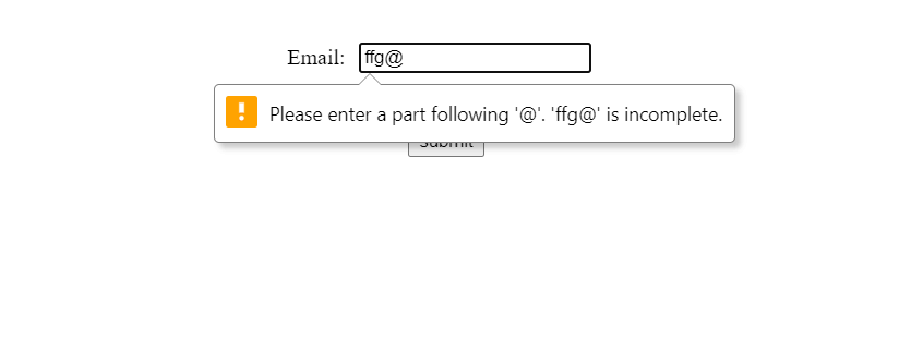
</form> The output for the above code:-

I would like I would like to show you an image when a user tries to input the wrong email address, and you will see when a user try to submit it will show a pop-up message like this:-
<input type=”file”>
As the name defines, the <input> type file gives a user control to select the file. Moreover, a user can select the file from their computer, which makes it possible to submit the same to the server with the form submission. Furthermore, you can assign accept attributes to ensure that a user can submit a file in that format.
The <input> type file will accept the file format in jpeg or png in the following code example.
Note: Pls check the browser support for this element. click here
Example of <input> type file –
<form method="post">
 <div>
  <label for="profile-pic">submit your picture</label>
  <input type="file" id="profile-pic" name="profile-picture" accept="image/png, image/jpeg">
 </div>
</form>
The output will be:-

<input type=”hidden”>
The <input> type hidden helps a developer to hide some sort of information so that they can use it in future. For example, a user is trying to submit the form and you want to give a user a unique id which is possible to assign by input type hidden. This Id will be hidden.
In the following code, I have assigned a value attribute to the input type hidden to submit the unique and hidden value to the server.
Note: This element is supported by all the browsers.
Example of <input> type hidden-
<form method="post">
<div>
<input type="hidden" id="user-info" name="user-info" value="1235">
<input type="text" placeholder="First name">
<input type="text" placeholder="Last name">
</div>
<div>
<input type="submit" value="submit">
</div>
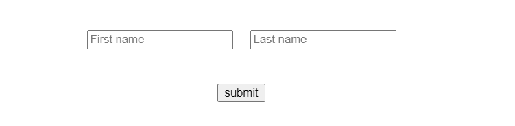
</form> You can see two input type text and one <input> type button, but hidden input type is invisible.
<input type=”image”>
The <input> type image provides an image instead of a text button while creating a form for the user. I have used the src attribute, but I don’t have the image on my computer; in that case, you can see the alt attribute’s value.
Note: This element is supported by all the browsers except Opera Mini and Chrome Android.
Example of <input> type image –
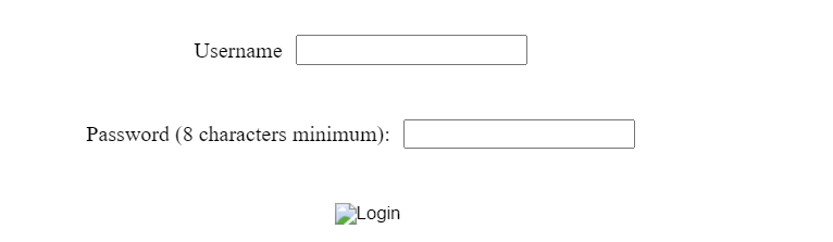
<form method="post">
 <div>
   <label for="username">Username</label>
   <input type="text" id="username" name="username">
  </div>
  <div>
   <label for="pass">Password (8 characters minimum):</label>
   <input type="password" id="pass" name="password" minlength="8" required>
  </div>
  <div>
   <input type="image" id="image" alt="Login" src="/media/examples/login-button.png">
  </div>
</form>
The output for the above code is:-
<input type=”month”>
The <input> type month provides a clickable box that contains the year and month. From that box, the user can select the year and month only. Pls, note it will not provide you the time to choose.
I have used the value and min attributes to have more control.
Note: Pls check the browser support for this element. click here
Example of <input> type month –
<form method="post">
 <div>
  <label for="start">Select month and year:</label>
 </div>
 <div>
  <input type="month" id="start" name="start" min="2001-03" value="2018-01">
 </div>
</form>
The output for the above HTML code is:-

<input type=”number”>
The <input> type number let the user enter the numerical value. Users can also see up and down arrows on the right side of the input box while hovering over to increase or decrease the numbers.
I have used the min and max attributes to control the values.
Note: Pls check the browser support for this element. click here
Example of <input> type number –
<form method="post">
 <div>
    <label for="people">Number of people</label>
  </div>
  <div>
    <input type="number" id="people" name="people" min="1" max="100">
  </div>
</form>
The out put for the above HTML code is:-

By default, this input type comes with validation that the user can only type numbers.
<input type=”password”>
The <input> type password is the type that is used most of the time while making apps and websites. This is useful to create a login form for the user. The most important aspect of this type is that the value entered by a user is hidden. In other words, the input value in the form of characters will convert into dots to make it secure for the user.
I have used required attribute which will not allow user to submit the form without password and minlength attribute to control the length of password.
I would recommend you to read more about attributes of this element. For more information click here
Note: Pls check the browser support for this element click here
Example of <input> type password –
<form method="post">
<div>
<label for="user-name">Username:</label>
<input type="text" id="user-name" name="username">
</div>
<div>
<label for="password">Password (7 characters minimum):</label>
<input type="password" id="password" name="password" minlength="7" required>
</div>
<div>
<input type="submit" value="Sign in">
</div>
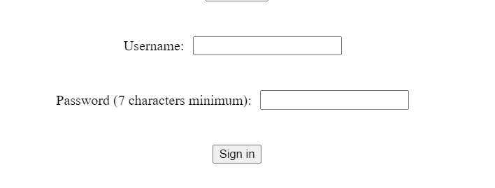
</form> The output for the above HTML code is:-
<input type=”radio”>
The <input> type radio works in a particular group, and they look like radio buttons in the shape of circles. Moreover, whenever you have to create the radio buttons, they should be under one name group, and this can be possible by assigning the same value to the name attribute to a group.
Once you have created a group, you can select anyone from that group of radio buttons.
I have assigned the name attribute with the value of color and you can see it is the same for all of the three input types because I have to make a group.
Note: This element is supported by all the browsers.
Example of <input> type radio –
<form method="post">
 <div><p>Select your favourite color:</p></div>
 <div>
  <input type="radio" id="red" name="color" value="red" checked>
  <label for="huey">Red</label>
 </div>
 <div>
  <input type="radio" id="blue" name="color" value="blue">
  <label for="dewey">Blue</label>
 </div>
 <div>
  <input type="radio" id="white" name="color" value="white">
  <label for="louie">White</label>
 </div>
</form>
The output after writing the code :-
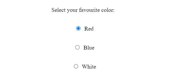
This input type is similar to the checkbox, but you have to create a group in the radio input type. In contrast, there is no need for a group for functioning.
<input type=”range”>
The <input> type range lets the user increase or decrease the provided min or max value with the help of a slider. You have to use the min attribute for minimum and max attributes to assign a maximum value.
The value to min ad max attribute should be a numeric.
Note: This element is supported by all the browsers except Opera Mini.
Example of <input> type range –
<form method="post">
 <div>
  <p>You can change the volume here:</p>
 </div>
 <div>
  <input type="range" id="vol" name="vol" min="0" max="13">
  <label for="vol">Volume</label>
 </div>
</form>
The Output for the above code:-

<input type=”reset”>
The <input> type reset generates a button that allows the user to reset all the input values in the form already filled.
It is not recommended to use the <input> type reset most of the time. That is because a user has filled all the form, which was a very lengthy process. If a user clicks a reset button by mistake, all the filled information in the form will be deleted.
Note: Pls check the browser support for this element click here
Example of <input> type reset –
<form method="post">
 <div class="controls">
   <label for="user-name">Username:</label>
   <input type="text" id="user-name" name="username" />
   <input type="reset" value="Reset">
   <input type="submit" value="Submit">
  </div>
</form
The output is:-

<input type=”search”>
The <input> type search creates a textbox to enter the strings by a user. This type helps users search anything on the website by writing in that textbox.
The search input box has a default cancel button on the right which pops up when you write in that box.
I would recommend you to read more about attributes of this element. For more information click here
Note: This element is supported by all the browsers.
Example of <input> type search –
<form method="post">
 <div>
   <label for="site-search">Search the site:</label>
   <input type="search" id="site-search" name="q" aria-label="Search through site content">
    <button>Search</button>
  </div>
</form>
The output for the above code:-

<input type=”submit”>
The <input> type submit creates a button that is used to submit the form by the user. When this button clicks by a user, all the form information has been submitted to the server.
The <input> type button comes with the value attribute which has the default value of submit assigned by the user agent.
I have written two input types here, one with default submit I have written two input types here, one with default submit value and send one has the value which I have assigned.
Note: This element is supported by all the browsers.
Example of <input> type submit –
<form method="post">
 <div>
    <input type="submit">
    <input type="submit" value="send Request">
  </div>
</form>
The output for this is:-

<input type=”tel”>
The <input> type tel allows the user to enter the telephone number in the input field. You can enhance the control of input type tel by assigning the size, minlength ,maxlength and pattern attributes.
Note: This element is supported by all the browsers except Opera Mini.
Example of <input> type tel –
<form method="post">
 <div>
  <input id="telNo" name="telNo" type="tel" size="20" minlength="9" maxlength="14" pattern="[0-9]{3}-[0-9]{3}-[0-9]{4}">
  </div>
</form>
The output for the above code:-

This input type does not validate automatically, so you have to use the pattern attribute to make a format for entering the telephone number.
<input type=”text”>
The <input> type text creates a textbox where a user can write anything in a single line, but the line break will not allow it.
I have also assigned the other attributes such as maxlength, minlength, size and required to this input type.
I would recommend you to read more about attributes of this element. For more information click here
Note: This element is supported by all the browsers.
Example of <input> type text –
<form method="post">
 <div>
   <label for="name">Name (5 to 10 characters):</label>
   <input type="text" id="name" name="name" required minlength="5" maxlength="10" size="10">
  </div>
</form>
The output is:-

<input type=”time”>
The <input> type of time lets a user select the time in hours, minutes and seconds from the pop-up window, which opens when a user clicks on the input field.
I have written the HTML code for input type time with attributes such as min and max.
Note: Pls check the browser support for this element click here
Example of <input> type time –
<form method="post">
 <div>
  <label for="arrival-time">Choose your arrival time</label>
  <input type="time" id="arrival-time" name="arrival-time" min="09:00" max="18:00" required>
  <small>Our office will close at 6pm</small>
 </div>
</form>
The output is:-

<input type=”url”>
The <input> element of type url allows a user to enter the url in the input field.
I have created an input type url with some extra attributes such as pattern, placeholder and required.
Note: This element is supported by all the browsers except Opera mini
Example of <input> type url –
<form method="post">
 <div>
  <label for="url">Enter the URL here:</label>
  <input type="url" name="url" id="url" placeholder="https://example.com" pattern="https://.*" size="40" required>
 </div>
</form>
The output is:-

Wrapping Up
You have seen that the type attribute of all these input types is powerful. I have tried to cover all the input types with code and images. All of these input types have their purpose, and you can use them according to their functionality and your requirements.
Do not forget to check the browser compatibility before Do not forget to check the browser compatibility before using these input types.
Happy coding!
Bonus:- examples with codepen
See the Pen HTML form input type by Jaspal (@jaspal9755) on CodePen.