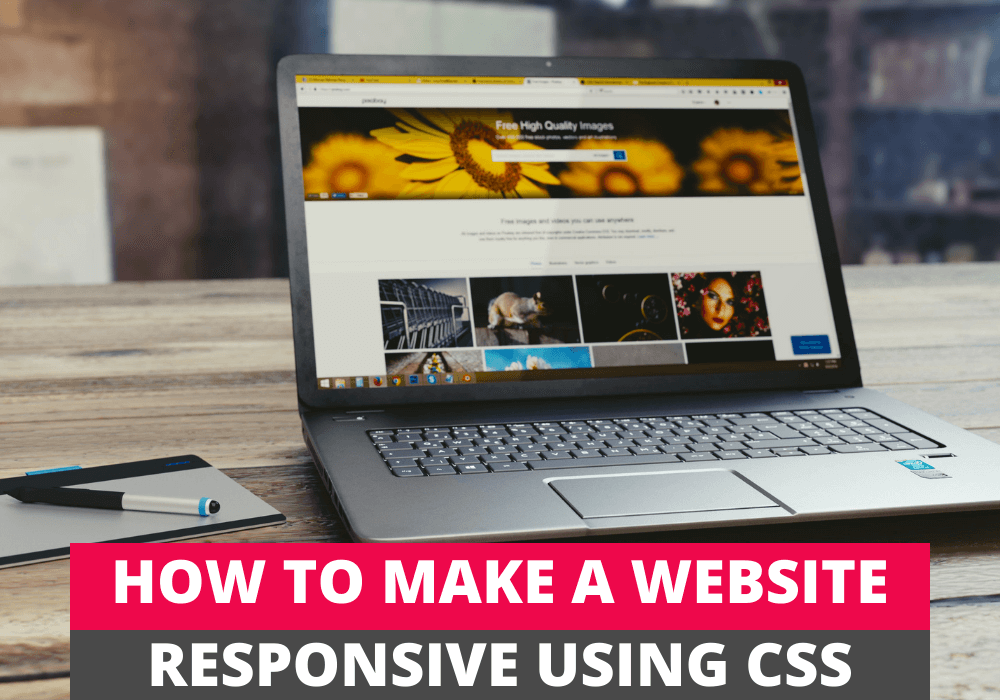
First of all, to make a website responsive, you have to understand what is a responsive website. The responsive word means your website should render or respond according to various devices such as mobile and desktop. Moreover, the website’s content should fit in the browser, or the elements of the website or a webpage such as images, fonts should change their position, width or height as per the screen size of a device to make it responsive.
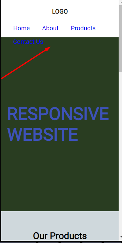
In the below three images, you can see that if we are not following the responsive rules or coding techniques, the website looks ugly. Moreover, containers, images and grids will flow out of the window screen, and users have to roll the screen left and right. These screenshots I have taken while making a demo website in codepen.
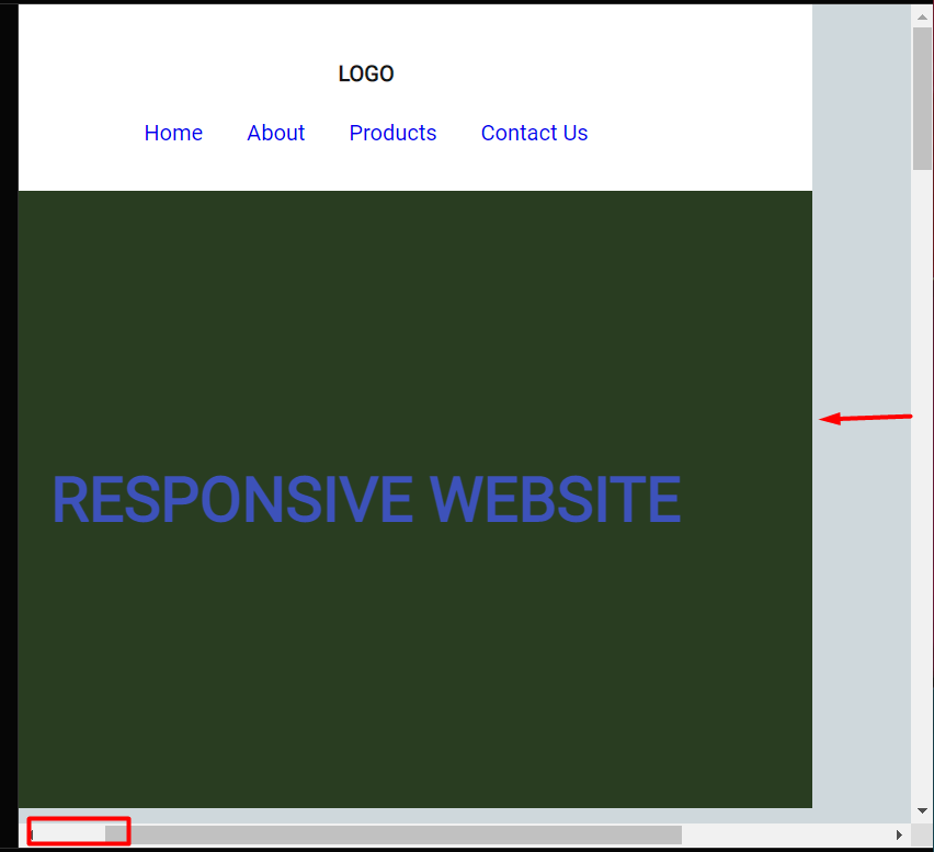
Now you will think about how we can make our webpage responsive, and this is possible by performing some steps, e.g. with the help of fluid images, fluid grid, breakpoints. We will discuss all of these concepts and much more of making a website responsive in this article. I have made a responsive demo with the help of codepen to explain to you everything, and we will try to answer why we need that rule and how we can apply that rule one by one.
Table of Contents
1. Always prefer the mobile-first approach
A Mobile-first approach is an approach where a web designer or developer will design the website or code the website according to the screen size of the mobile. After that, the designer will scale that up according to the other devices, including laptops or desktop screens.
Why We Need A Mobile-first Approach
I have seen that when you try to make a website and begin coding as per the mobile-first approach, you can focus on key features of the website, such as navbar and images. Moreover, most of your work has already been finished by just writing the basic code to achieve the mobile-first approach. Secondly, I have seen that once you have designed the mobile-first website, it is much easier to expand it on the other device screens by using less code. Thirdly, according to a recent survey in 2021, currently, 7.10billion people have their own phones, which is 89% of the total world population. Finally, Google will index only those websites that have the mobile-first approach.
How We Can Achieve That
However to perform the mobile-first approach there is no need of a lo of code. All you have to do is write the basic CSS along with some padding and margins. However, you have to use flexbox to make your navbar responsive.
To achieve the mobile-first target, I have written the basic styles and padding, margin, and flexbox for the navbar. Our code for CSS will be like this. You do not need to use media queries. I have given the padding left and right to the container, a wrapper inside a specific section. On the other hand, Images should have a max-width of 100%. We will discuss more images in the below paragraph. I have also assigned the display property with the value of flex to the header container and the navbar ul to wrap and align them.
.container{
  padding:0 1.5rem;
}
img{
  display:block;
  max-width:100%;
  height:auto;
}
header .container{
  height:10rem;
  display:flex;
  flex-direction:column;
  align-items:center;
  justify-content:center;
}
nav ul{
  display:flex;
  flex-wrap:wrap;
  align-items:center;
}
Here is the demo of what I have written in the codepen. You can see our containers are not overflowing because our images are responsive, and we have given room to our containers using paddings on both sides. Also, our menu is not even overflowing.
See the Pen responsive layout by Jaspal (@jaspal9755) on CodePen.
2. Use the relative units
Relative units are the units relative to the root element’s font size, in some cases to parent element or relative to the viewport size. Examples of relative units are rem, em, rem, vh, vw, ch, ex, vmin, vmax and, 1h. On the other hand, absolute units are fixed units, and they are not relative to anything. Examples of absolute units are pixels(px), points(pt), cem(centimetres) etc.
Why relative units are the best choice
You should use the relative units because these CSS units are relative to the font size of HTML font size, and if someone changes the browser’s font size for accessibility, which is default 16px, these units will also change their size. I will always recommend using rem for font size as these will make the website responsive by changing font size as per viewport font size.
I will show through the screenshot that how relative units rem depends on the font-size of the root element(HTML). Some users can change the font-size of the browser through the settings according to their accessibility need.
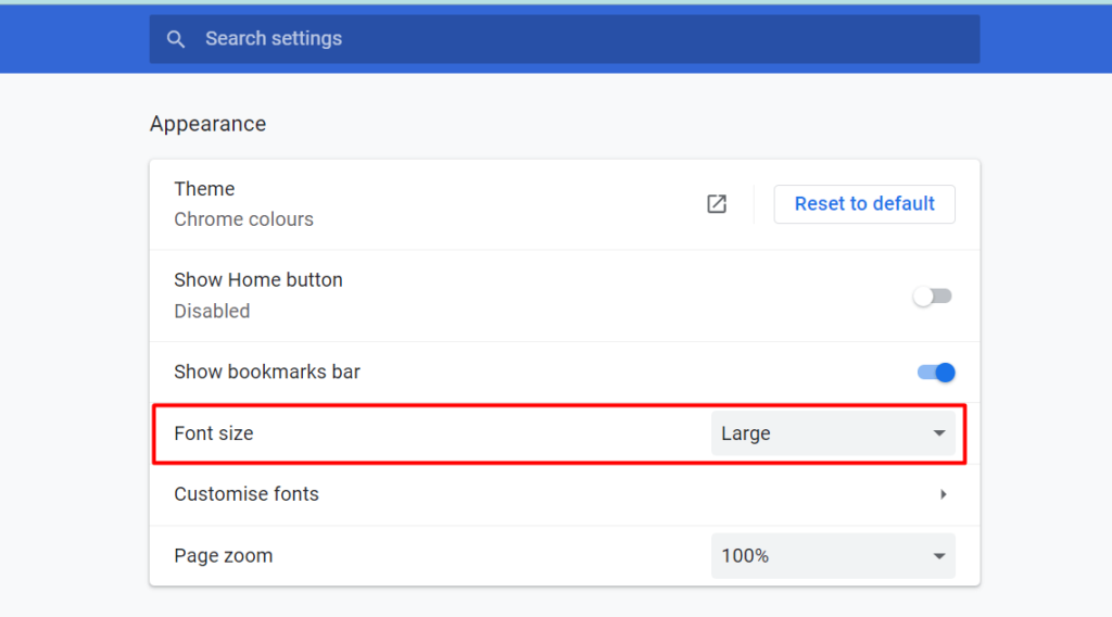
You can compare the two screenshots below that; after changing the font-size in the browser settings, the font-size on the right-hand side screenshot of our website has also been increased because of rem units.
I have used rem for padding, font-size , margin and height . However, I have used % for width . This is how you can make your website responsive with relative units. You have also noticed that I have used em units for padding for the button. It will center the text as peer font-size of a button. I will recommend you to have a look at the previous example of codepen for relative units.
3. Begin with global styling
Global styling is the basic style of your primary elements of the website. For example, elements such as anchor(a), paragraph(p), body, header, footer and headings(h1 to h6) can be styled upfront, and this is known as global styling because it will apply on these elements wherever they exist on the website. You don’t have to write different code for these elements for a separate page.
You don’t need to worry about page layout at this very early stage because your only purpose is to achieve the mobile layout. Once you apply these styles, these will remain on all the pages to make a website responsive.
I have written the global styling in the below codepen demo:-
*{
  padding:0;
  margin:0;
  box-sizing:border-box;
}
html{
  font-size:62.5%;
}
body{
  font-family: 'Roboto', sans-serif;
  line-height:1.2;
  background-color:#CFD8DC;
  font-size:1.6rem;
}
.container{
  padding:0 1.5rem;
}
li{
  list-style:none;
}
a{
  text-decoration:none;
}
h1{
  margin:1rem 0;
}
img{
  display:block;
  max-width:100%;
  height:auto;
}
button{
  width:10rem;
  height:2rem;
  padding-bottom:2em;
  padding-top:1em;
  cursor:pointer;
  border:1px solid;
  letter-spacing:0.1rem;
  font-weight:700;
  transition:.4s ease-in-out;
}
button:hover{
  background-color:#282829;
  color:#fff;
}
4. Do not use fixed sizes
Width and height properties are commonly used during website development to make it responsive, but if you are using them with the fixed width or height, it can cause problems of overflowing. Let me show you an example. I have given the fixed height of 10rem to our header in the demo codepen, and when I shrink it to the mobile size viewport, the elements(nav) overflow the header element.
To avoid this problem and make the website responsive, you should use max-width or min-width instead of fixed width. On the other hand, Use min-height or max-height instead of fixed height. You should know about max and min values. I have used min-height for the header element, and this will solve the problem.
/* HEADER */
header{
  background-color:#ffff;
  color:white;
  min-height:10rem;
/*   height:10rem; */
  padding:1.8rem 0;
}
5. Make your grids fluid for responsive website
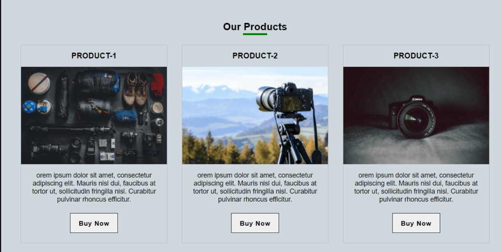
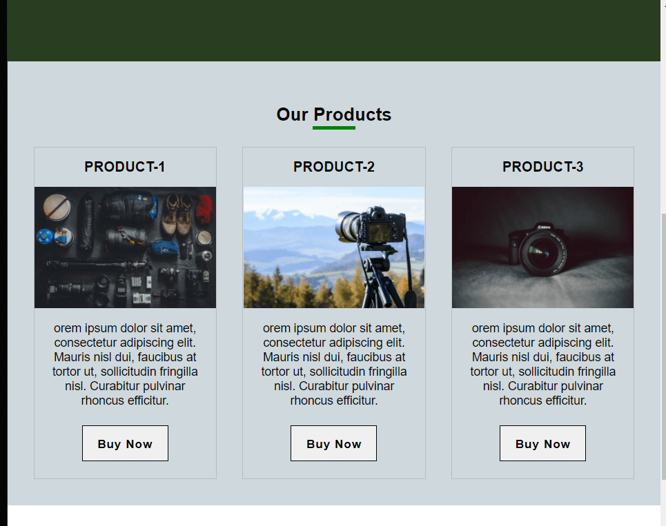
Our next step to have a responsive website is to make our grids fluid as per viewport or window size. This means website columns adapt their width according to the screen size. If you are not changing the width of your columns according to the width of the window size of a device, they will stack on each other, and this will result in a bad user experience on large screens.
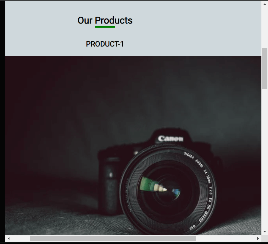
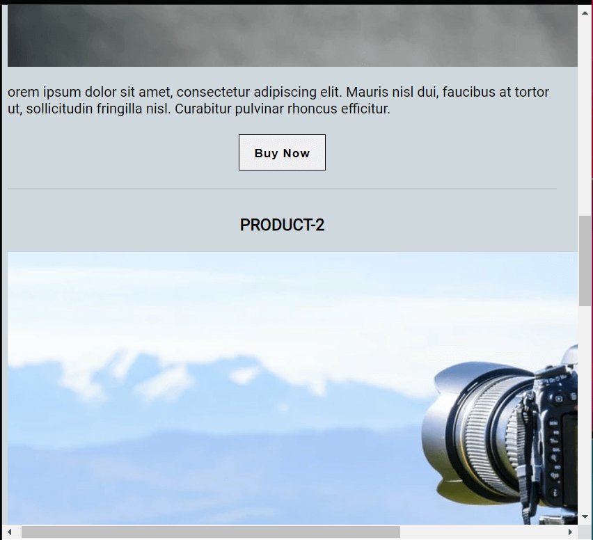
Let me show you a screenshot where I have not used the fluid grids for wider screens, and columns are stacked on each other. You can see how big the images are when we see them on the tablet size screen.
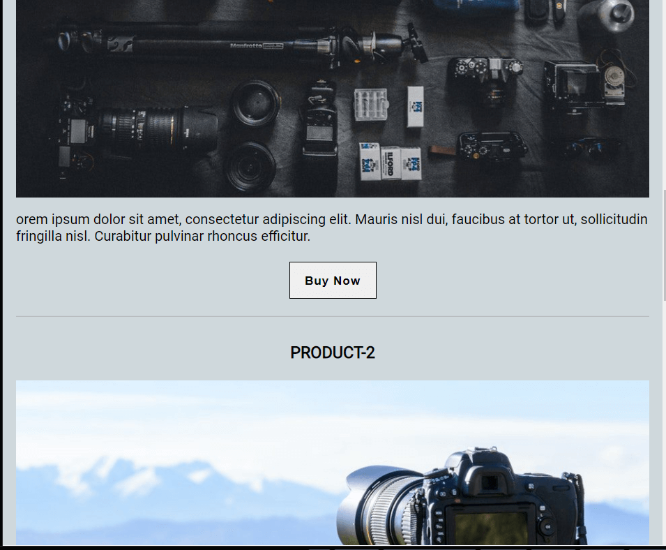
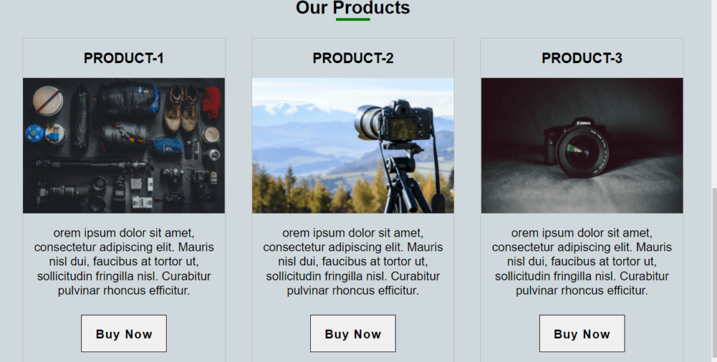
To make our website columns or grids responsive, we need to change their width on different devices, and I have given all the columns of products with a width of 33% . They will change their width when the screen size is a minimum of 468px(tablet size screen) with the help of media queries.
..product-col{
         border: 1px solid rgba(0,0,0,0.125);
         width:33%;
         margin: 0 1.5rem;
    }
The result will be like this:-
6. Fluid-images
We will always use images to make our website look beautiful. For beginners, it is always a challenge to make an image responsive or fluid. This also means that they should always fit into the container size regardless of what size it is.
To make an image responsive, we can use max-width property with a value of 100%. Our CSS code will look like this.
img{
  display:block;
  max-width:100%;
  height:auto;
}
Pls, watch the three columns fluid grid image in the above example where images have changed their width according to their container because of max-width.
8. Use of media queries
In today’s scenario, we are using the internet on various types of devices, such as mobile, tablet or desktop computers with different sizes of window size. This will create a question in our mind about how to make our website responsive to these sorts of different size windows.
To solve these problems, CSS has provided us with media queries, and these help us change any element on our website on different breakpoints. There are two types of media queries, one with min-width property, which means the window size’s starting point, from where the elements will begin change, and the other one is max-width, which means the endpoint of window size. where the elements will stop changing. For example, you can use the following min-width breakpoints or media queries which means the elements will change when the window size is minimum of the given width.
I will suggest avoid too many breakpoints. Do not go for device specific breakpoints.
// Small devices (landscape phones, 576px and up)
@media (min-width: 576px) {  }

// Medium devices (tablets, 768px and up)
@media (min-width: 768px) {  }

// Large devices (desktops, 992px and up)
@media (min-width: 992px) {  }

// X-Large devices (large desktops, 1200px and up)
@media (min-width: 1200px) {  }

// XX-Large devices (larger desktops, 1400px and up)
@media (min-width: 1400px) {  }
I have used the media queries to create a fully responsive demo in the codepen after using min-width
/*  MEDIA QUERIES*/

@media (min-width: 768px) {
  header{
    padding:0;
  }
  header .container{
    flex-direction:row;
  }
  .logo{
    margin-right:auto;
  }
  .product-container {
    display:flex;
    width:100%;
  }
  .product-col{
    border: 1px solid rgba(0,0,0,0.125);
    width:33%;
    margin: 0 1.5rem;
    }
  .card-body{
   padding:0 1rem;
  }
  .card-body p{
    text-align:center;
  }
  .card-header h3{
    margin-bottom:0;
    padding:1.3rem;
  }
}
The codepen demo for your reference:-
See the Pen fully responsive css layout by Jaspal (@jaspal9755) on CodePen.
Wrapping Up
This is how the methods as mentioned earlier contribute to responsive design. The only way to understand these methods is to practice again and again. I will also recommend that you try to use the Chrome developer tool, which will show you what is happening on your page, and you can even do some experiments over there. I hope this article will help you learn about creating a responsive website. Happy Coding!