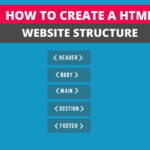
After learning the basic elements of HTML language and the purpose of every element, we often try to use them to make websites. Even after trying to practice making the same sort of websites from the internet, we don’t know the HTML document structure of every website. To make an HTML website structure, we use various HTML elements. Moreover, there is an order to place these elements on the HTML page. This article will explain how to create an HTML website structure with the help of structural HTML elements and we will try to implement below image structure with the help of HTML elements.
You can only see the content inside the <body> element when the whole document is rendered in the browser, while the content in the <head> element will be invisible.
Table of Contents
<!doctype html>
<!doctype> is not a tag in HTML. You can write !doctype in small or capital letters. !doctype means it will tell the browser that this HTML page is using what version of HTML as a result what to expect. So it is used for declaration.
Html element (<html>)
The first element from our website structure is the <html> element, also called the root element. All of the other HTML elements will come under this element. This is how it will look like:-
<!doctype html>
<html>
</html>
Head element (<head>)
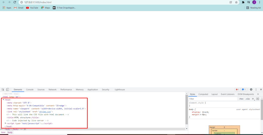
Our second element of the HTML page structure is known as the <head>. This element, by default, is hidden. Users will not see what you have written inside this HTML element. The head element uses <meta> tags to provide information about the document’s author, title and character set about your website. Moreover, You can also use it to link your external CSS file with the help of the <link> element. Moreover, it can also contain <script> elements.
<!DOCTYPE html>
<html lang="en">
 <head>
  <meta charset="UTF-8">
  <meta http-equiv="X-UA-Compatible" content="IE=edge">
  <meta name="viewport" content="width=device-width, initial-scale=1.0">
  <link rel="stylesheet" href="styles.css">
  <title>Html Document</title>
 </head>
</html>
You can see in the below image that our HTML page has rendered in the browser but you can’t see the information inside the head element. I have open the web developer tool from the browser settings or you can use ALT+CTRL+I to open it.
Body element (<body>)
<body>element of HTML is the element who will contain all other elements which you want to render in the browser. This element is used represent main content of a document in front of a web user. The elements such as <header>, <main>, and <footer> are the child elements of the body element. We will write this code as below:-
<!DOCTYPE html>
<html lang="en">
 <head>
  <meta charset="UTF-8">
  <meta http-equiv="X-UA-Compatible" content="IE=edge">
  <meta name="viewport" content="width=device-width, initial-scale=1.0">
  <link rel="stylesheet" href="styles.css">
  <title>Document</title>
 </head>
 <body>
 </body>
</html>
Main element (<main>)
<main> element will contain all the other section elements which includes <header>, <footer>, <sections> and <aside>. Moreover, <main> will work as a wrapper or a container for all the other child elements.
<!DOCTYPE html>
<html lang="en">
<head>
  <meta charset="UTF-8">
  <meta http-equiv="X-UA-Compatible" content="IE=edge">
  <meta name="viewport" content="width=device-width, initial-scale=1.0">
  <link rel="stylesheet" href="styles.css">
  <!-- This will link the CSS file with html document -->
  <title>Document</title>
</head>
<body>
  <main>
  </main>
</body>
</html>
Header element (<header>)
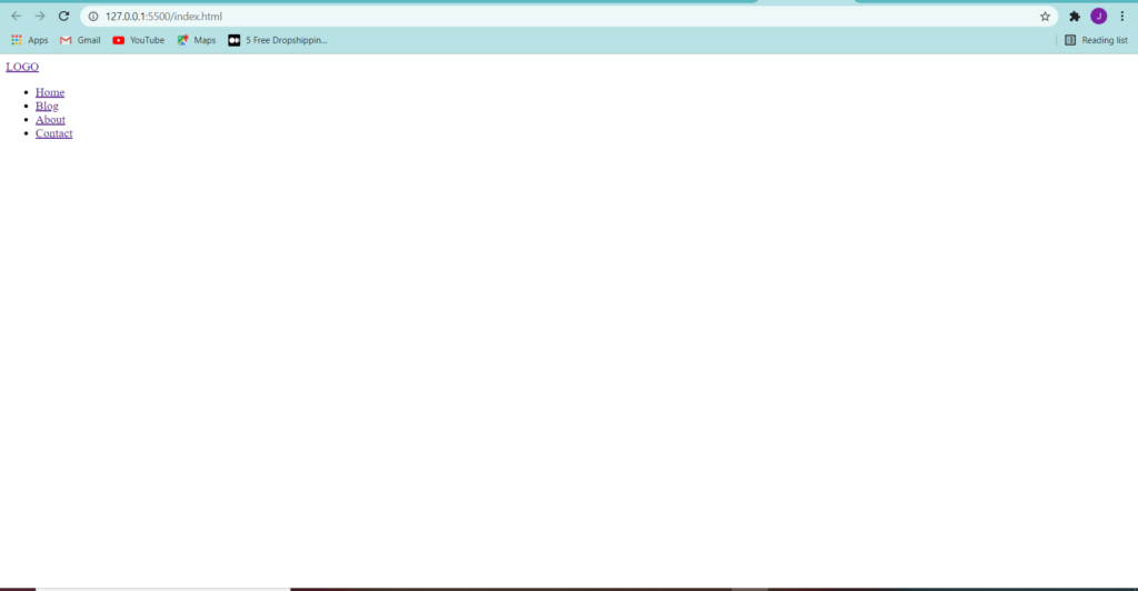
The <header> element is where the HTML coding starts because whatever you write from here will appear in the browser. This element usually contains the logo and navigation bar of a website and will appear on the top of all the elements in the browser. Logo can be an image in <a> element or just a text, whereas the navigation bar represents with the help of <nav> element. Our HTML code will look like this:-
<!DOCTYPE html>
<html lang="en">
<head>
  <meta charset="UTF-8">
  <meta http-equiv="X-UA-Compatible" content="IE=edge">
  <meta name="viewport" content="width=device-width, initial-scale=1.0">
  <link rel="stylesheet" href="styles.css">
  <title>Document</title>
</head>
<body>
  <header>
    <a href="">LOGO</a>
    <nav>
      <ul>
        <li><a href="">Home</a></li>
        <li><a href="">Blog</a></li>
        <li><a href="">About</a></li>
        <li><a href="">Contact</a></li>
      </ul>
    </nav>
  </header>
</body>
</html>
The code I have written above will bring us the following result in the browser.
Section element (<section>)
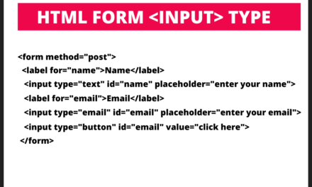
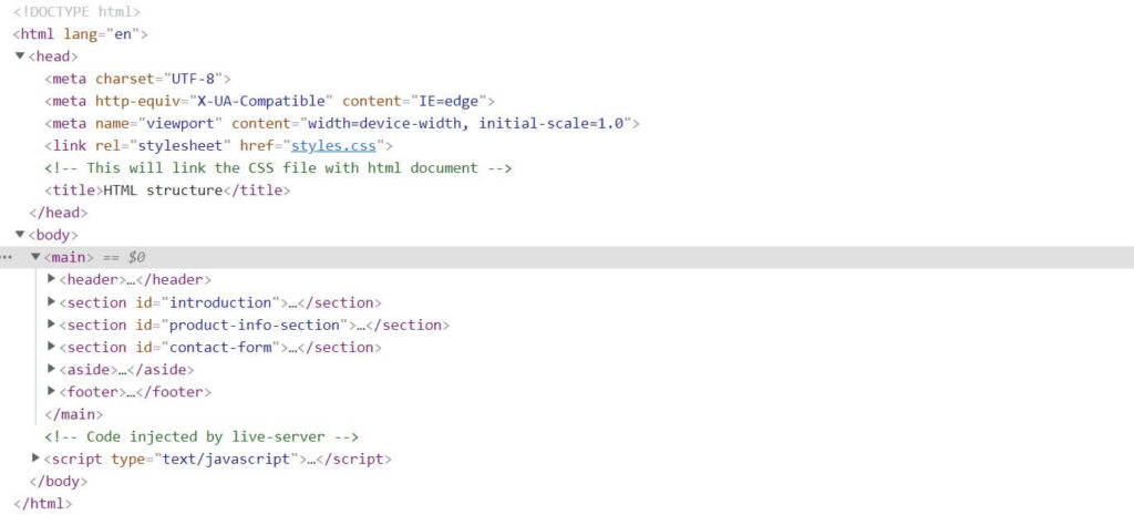
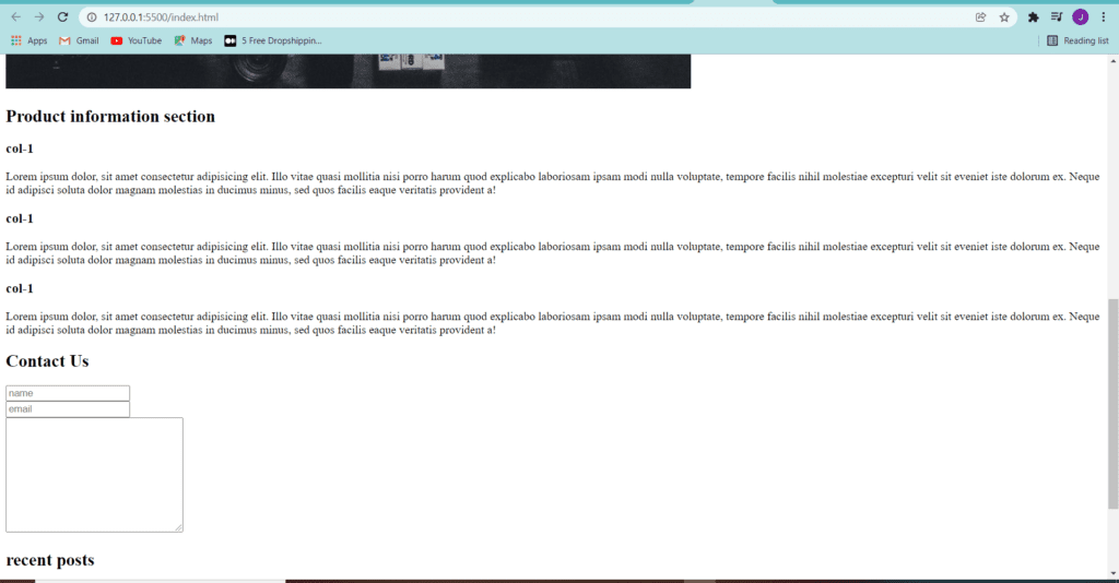
The <head> element defines a specific section with detailed information about a website. The collection of sub-elements such as headings, div, paragraph, buttons and contact form represents the particular section. You can write this element under the main element after the header. You can see in the below image that we have three-section, introduction, product info and a contact form. All of the sections contain child elements such as <div>, <h2>, <p> and <img> elements.
<!DOCTYPE html>
<html lang="en">
<head>
  <meta charset="UTF-8">
  <meta http-equiv="X-UA-Compatible" content="IE=edge">
  <meta name="viewport" content="width=device-width, initial-scale=1.0">
  <link rel="stylesheet" href="styles.css">
  <!-- This will link the CSS file with html document -->
  <title>HTML structure</title>
</head>
<body>
  <main>
   <header>
    <a href="">LOGO</a>
    <nav>
      <ul>
        <li><a href="#">Home</a></li>
        <li><a href="#">Blog</a></li>
        <li><a href="#">About</a></li>
        <li><a href="#">Contact</a></li>
      </ul>
    </nav>
   </header>
   <section id="introduction">
     <h1>Welcome</h1>
      <div id="intro--col">
       <p>
         This is the introduction column
       </p>
     </div>
     <div class="intro-img">
      <img src="https://bl6pap004files.storage.live.com/y4m9hMU9t2h4OfiN-mNa0XqaKyqMvPD_Jpt5vgs-kTXhq0KV-LZtroyCeHiHFq1LnGSnhDSvrxfx-
        vsds4oFLeAI96ciz7lJMZ9tROFKUr7MXRVEM3qaUvbZUPS1vmN-OnVqL6WY_e0Cr-vwflfiPufxF0c2gnAzoy03G-P5jOvIDun3yYrAZMtKGhtPHYq-sak?
        width=940&height=630&cropmode=none" alt="">
     </div>
   </section>
   <section id="product-info-section">
     <h2>Product information section</h2>
     <div class="product-info-col">
       <h3>col-1</h3>
       <p>Lorem ipsum dolor, sit amet consectetur adipisicing elit. Illo vitae quasi mollitia nisi porro harum quod explicabo laboriosam ipsam modi n
            ulla voluptate, tempore facilis nihil molestiae excepturi velit sit eveniet iste dolorum ex. Neque id adipisci soluta dolor magnam
            molestias in ducimus minus, sed quos facilis eaque veritatis provident a!</p>
     </div>
     <div class="product-info-col">
      <h3>col-1</h3>
      <p>Lorem ipsum dolor, sit amet consectetur adipisicing elit. Illo vitae quasi mollitia nisi porro harum quod explicabo laboriosam ipsam modi
          nulla voluptate, tempore facilis nihil molestiae excepturi velit sit eveniet iste dolorum ex. Neque id adipisci soluta dolor magnam molestias
          in ducimus minus, sed quos facilis eaque veritatis provident a!</p>
     </div>
   </section>
   <section id="contact-form">
     <h2>Conatc Us</h2>
    <form action="">
      <div>
        <input type="text" placeholder="name">
     </div>
     <div>
        <input type="email" placeholder="email">
     </div>
     <div>
        <textarea name="" id="" cols="30" rows="10"></textarea>
      </div>
      </div>
    </form>
   </section>
 </main>
</body>
</html>
After writing the above code we have following result and you can see two sections in the image, product-info and contact form.
Aside element (<aside>)
The <aside> element contains the content related to the content around the aside element. For example, I made a post on how to make a website, and I will use aside to create a short heading with the help of an <a> element, and when someone clicks on that link, it will open the post page to read that post. Moreover, you can also use it for advertising on your website. Most of the time, aside is used to create a sidebar on a website. The code I have written below has the sidebar, but you can only make it a sidebar after using CSS.
<!DOCTYPE html>
<html lang="en">
<head>
  <meta charset="UTF-8">
  <meta http-equiv="X-UA-Compatible" content="IE=edge">
  <meta name="viewport" content="width=device-width, initial-scale=1.0">
  <link rel="stylesheet" href="styles.css">
  <!-- This will link the CSS file with html document -->
  <title>HTML structure</title>
</head>
<body>
  <main>
   <header>
    <a href="">LOGO</a>
    <nav>
      <ul>
        <li><a href="#">Home</a></li>
        <li><a href="#">Blog</a></li>
        <li><a href="#">About</a></li>
        <li><a href="#">Contact</a></li>
      </ul>
    </nav>
   </header>
   <section id="introduction">
     <h1>Welcome</h1>
      <div id="intro--col">
       <p>
         This is the intoduction column
       </p>
     </div>
     <div class="intro-img">
      <img src="https://bl6pap004files.storage.live.com/y4m9hMU9t2h4OfiN-mNa0XqaKyqMvPD_Jpt5vgs-kTXhq0KV-LZtroyCeHiHFq1LnGSnhDSvrxfx-
     vsds4oFLeAI96ciz7lJMZ9tROFKUr7MXRVEM3qaUvbZUPS1vmN-OnVqL6WY_e0Cr-vwflfiPufxF0c2gnAzoy03G-P5jOvIDun3yYrAZMtKGhtPHYq-sak?width=940&height=630&cropmode=none" alt="">
     </div>
   </section>
   <section id="product-info-section">
     <h2>Product information section</h2>
     <div class="product-info-col">
       <h3>col-1</h3>
       <p>Lorem ipsum dolor, sit amet consectetur adipisicing elit. Illo vitae quasi mollitia nisi porro harum quod explicabo laboriosam ipsam modi nulla voluptate, tempore facilis nihil molestiae excepturi velit sit eveniet iste dolorum ex. Neque id adipisci soluta dolor magnam molestias in ducimus minus, sed quos facilis eaque veritatis provident a!</p>
     </div>
     <div class="product-info-col">
      <h3>col-1</h3>
      <p>Lorem ipsum dolor, sit amet consectetur adipisicing elit. Illo vitae quasi mollitia nisi porro harum quod explicabo laboriosam ipsam modi nulla voluptate, tempore facilis nihil molestiae excepturi velit sit eveniet iste dolorum ex. Neque id adipisci soluta dolor magnam molestias in ducimus minus, sed quos facilis eaque veritatis provident a!</p>
     </div>
   </section>
   <section id="contact-form">
     <h2>Contact Us</h2>
    <form action="">
      <div>
        <input type="text" placeholder="name">
     </div>
     <div>
        <input type="email" placeholder="email">
     </div>
     <div>
        <textarea name="" id="" cols="30" rows="10"></textarea>
      </div>
      </div>
    </form>
   </section>
   <aside>
     <h2>recent posts</h2>
      <div><a href="#">How to make a website</a></div>
      <div><a href="#">How to write CSS</a></div>
      <div><a href="#">Five best books on HTML</a></div>
   </aside>
 </main>
</body>
</html>
Footer element (<footer>)
<footer> is the last element on the bottom of HTML document, and it represents information about navigation, business address and a small contact form. The information which is given in this element depends on what sort of website it is. For example, a blog website will represent the popular post in the footer. On the other hand, a business website describes its address and hours.
<!DOCTYPE html>
<html lang="en">
<head>
  <meta charset="UTF-8">
  <meta http-equiv="X-UA-Compatible" content="IE=edge">
  <meta name="viewport" content="width=device-width, initial-scale=1.0">
  <link rel="stylesheet" href="styles.css">
  <!-- This will link the CSS file with html document -->
  <title>HTML structure</title>
</head>
<body>
  <main>
   <header>
    <a href="">LOGO</a>
    <nav>
      <ul>
        <li><a href="#">Home</a></li>
        <li><a href="#">Blog</a></li>
        <li><a href="#">About</a></li>
        <li><a href="#">Contact</a></li>
      </ul>
    </nav>
   </header>
   <section id="introduction">
     <h1>Welcome</h1>
      <div id="intro--col">
       <p>
         This is the intoduction column
       </p>
     </div>
     <div class="intro-img">
      <img src="https://bl6pap004files.storage.live.com/y4m9hMU9t2h4OfiN-mNa0XqaKyqMvPD_Jpt5vgs-kTXhq0KV-LZtroyCeHiHFq1LnGSnhDSvrxfx-vsds4oFLeAI96ciz7lJMZ9tROFKUr7MXRVEM3qaUvbZUPS1vmN-OnVqL6WY_e0Cr-vwflfiPufxF0c2gnAzoy03G-P5jOvIDun3yYrAZMtKGhtPHYq-sak?width=940&height=630&cropmode=none" alt="">
     </div>
   </section>
   <section id="product-info-section">
     <h2>Product information section</h2>
     <div class="product-info-col">
       <h3>col-1</h3>
       <p>Lorem ipsum dolor, sit amet consectetur adipisicing elit. Illo vitae quasi mollitia nisi porro harum quod explicabo laboriosam ipsam modi nulla voluptate, tempore facilis nihil molestiae excepturi velit sit eveniet iste dolorum ex. Neque id adipisci soluta dolor magnam molestias in ducimus minus, sed quos facilis eaque veritatis provident a!</p>
     </div>
     <div class="product-info-col">
      <h3>col-1</h3>
      <p>Lorem ipsum dolor, sit amet consectetur adipisicing elit. Illo vitae quasi mollitia nisi porro harum quod explicabo laboriosam ipsam modi nulla voluptate, tempore facilis nihil molestiae excepturi velit sit eveniet iste dolorum ex. Neque id adipisci soluta dolor magnam molestias in ducimus minus, sed quos facilis eaque veritatis provident a!</p>
     </div>
     <div class="product-info-col">
      <h3>col-1</h3>
      <p>Lorem ipsum dolor, sit amet consectetur adipisicing elit. Illo vitae quasi mollitia nisi porro harum quod explicabo laboriosam ipsam modi nulla voluptate, tempore facilis nihil molestiae excepturi velit sit eveniet iste dolorum ex. Neque id adipisci soluta dolor magnam molestias in ducimus minus, sed quos facilis eaque veritatis provident a!</p>
     </div>
   </section>
   <section id="contact-form">
     <h2>Contact Us</h2>
    <form action="">
      <div>
        <input type="text" placeholder="name">
     </div>
     <div>
        <input type="email" placeholder="email">
     </div>
     <div>
        <textarea name="" id="" cols="30" rows="10"></textarea>
      </div>
      </div>
    </form>
   </section>
   <aside>
     <h2>recent posts</h2>
      <div><a href="#">How to make a website</a></div>
      <div><a href="#">How to write CSS</a></div>
      <div><a href="#">Five best books on HTML</a></div>
   </aside>
  <footer>
    <nav>
      <ul>
        <li><a href="#">Home</a></li>
        <li><a href="#">Blog</a></li>
        <li><a href="#">About</a></li>
        <li><a href="#">Contact</a></li>
      </ul>
    </nav>
    <div><p>@copywrite 2021 coderizzle.com</p></div>
  </footer>
 </main>
</body>
</html>
Wrapping Up
You can use the above elements to make a HTML website or document structure. You can see that it is a hierarchy of all the essential elements, and after that, you can add up other child elements. This article is for beginners to learn HTML website structure, and after reading this article, you can read our detailed article on how to make a website responsive with CSS.